Why are there so many red colors in fast-food brand logos? Haven’t noticed it? Well, here are the names; Mcdonald’s, Arby’s, Wendy’s, Burger King, In-N-Out, and the list goes on and on. These fast-food brands all use the color red in their logos. The reason is simple; Color psychology.
Color is essential when it comes to marketing due to its influence on the human mind. One might wonder, how much of an impact would colors have on brand marketing? Well, to simply put it, color is one of the key factors that decide the success of a brand. It directly interferes with the brand impression and purchase rate.
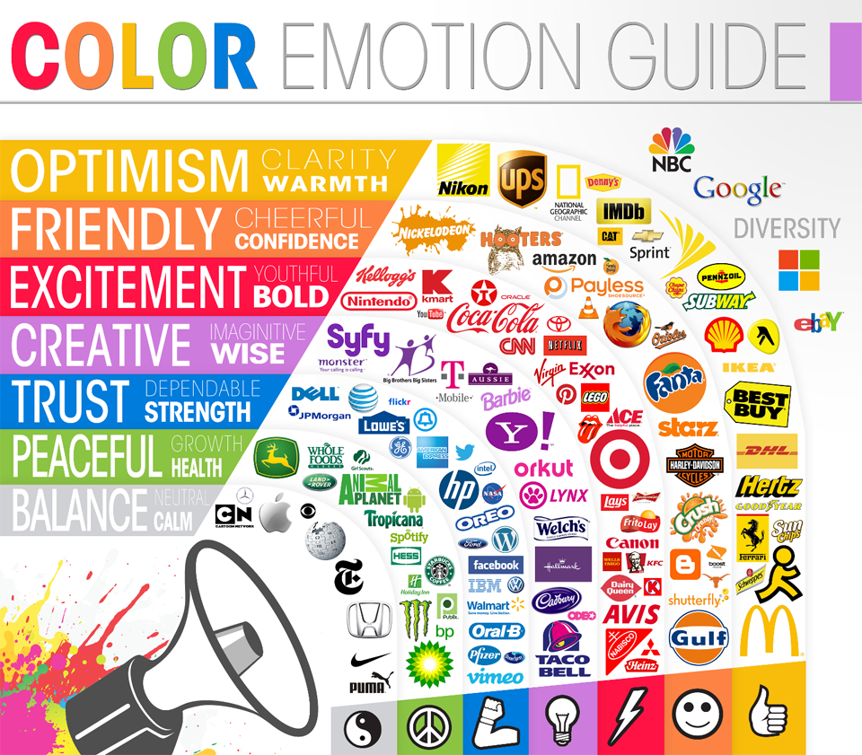
Color Emotions
1. Red
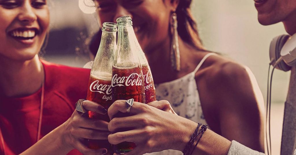
First up, the color red. Red is by far the most used color in brands. From fun and delicious to serious and heavy, it covers a very wide range of people’s emotions. It encourages people’s appetites, creates a sense of emergency, and gives a bold impression. Eventually putting you in a world of red, surrounded by all sorts of logos including Youtube, Lego, and CNN. Apart from logos, it is also frequently used in temporary marketing strategies like clearance sales. When you spot a red sign out in a shopping center, run like Usain Bolt because they are having a huge sale.
2. Yellow
We’ve all colored our sunflowers and our cute little outfits yellow. So I’m sure you can all guess what emotion yellow represents. It brings out warmth and sunshine in people. It emphasizes the happy service they provide. We Playstock also used the color yellow in our logos to highlight a fun and creative image. Take a look at DHL for example. You can’t miss the yellow on their logo. But what does DHL have to do with happiness? Well, I feel very psyched when I get my package!

Besides the smiley impression, it is also used on warnings and deceitful messages. Roads are filled with road signs in yellow along with the color red and black. Stay wide awake and look out for accidents.
3. Black
‘The New Black’. It is a phrase used to describe something very popular and trendy. Which explains why so many brands prefer this color. People feel immediately attached to the color black. Let’s see why that is. The color black brings out the sophisticated, strong, and powerful image in a brand. The use of this color is strictly divided. Whereas fashion brands show affection to the color, it is never used in health or nature brands. The top brands that use black shades would be Chanel and Nike. With this powerful color, both brands help their buyers feel secured. Especially in the case of Chanel, their products make their customers feel as if they have been crowned. Want to feel confident again? Look for brands with black, powerful logos and see if it helps.
Source: Marilyn and Chanel N°5 by CHANEL
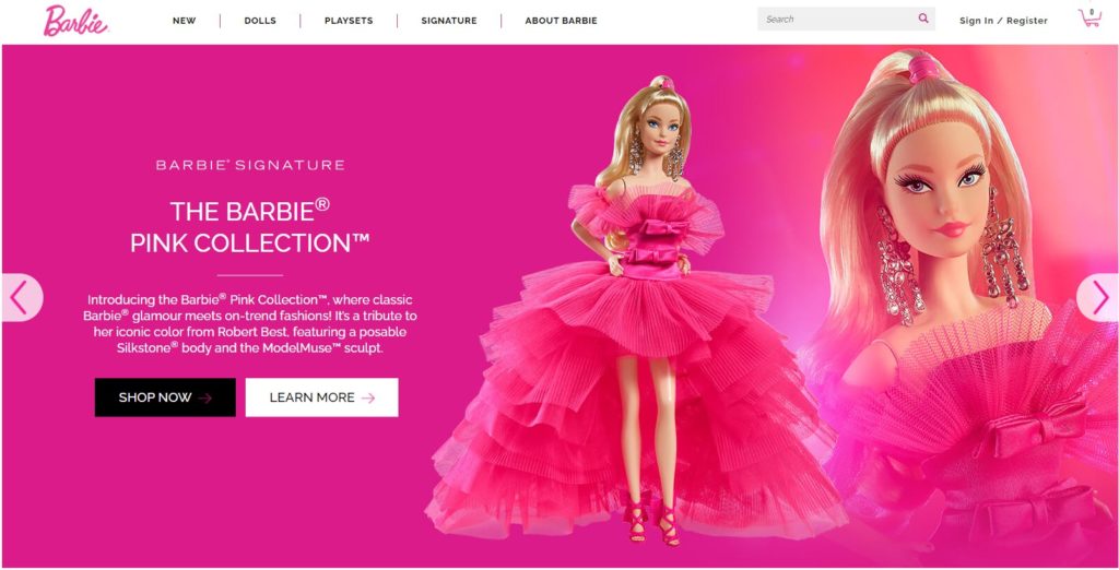
4. Pink
What comes to mind when you think of the color pink? A lot of feminine products, I assume. Pink generally symbolizes love, warmth, affection, and respect. Also, it was a color that represented females. So it is no surprise to see many feminine brands have pink logos such as Victoria’s Secret or Barbie. The color pink emphasizes the femininity and sensitive nature the society expected in a woman. Thus it was considered a women’s color, and men in conservative society did not dare to touch it. Well, guys, guess what? Pink is now the new black.
How does color influence purchases?
But do they actually have an impact on the purchase rate? The answer is YES. The influence is greater than expected. A survey has shown that 93% of the buyers focus on visual appearances, and 85% of them place color as the primary reason for choosing a particular product. This result supports the significance colors carry in brands. Also, the association between colors and brands is inseverable as color increases brand recognition up to 80%, which outputs consumers’ unconscious attachment to the brand.
Think of a color and see what pops up in your head. It would probably be an emotion or a particular brand. That is how much color impacts brand recognition. Now when you want to make a logo of your own, put as much effort as you can into choosing a color. It is something that would follow your brand forever. Although this article told you colors with general, familiar impressions, you don’t have to stick to the cliche. With the right color, you will own that color on your own, just like Tiffany’s.
Check out for more articles here!